

Here at Button, we strive to find ways to improve our brand, user experience, and efficiency both internally and externally. We're happy to introduce our latest improvement to the brand, the Button Design System!
What is a design system?
For those of you who are not familiar with a design system, it is a collection of repeatable components and styles with a standard guide on when, where, and how to use each. These components can be assembled together to build applications and products.
Design systems can vary across organizations—some are just style guides, some include components, and others can be heavy product design. We ran a vision exercise with stakeholders from product, design, engineering, and marketing to help us define what our design system should look like.
Benefits
Having a design system doesn't just benefit a design team, it also creates transparency and alignment with engineers and internal stakeholders. By having a pre-built library of design elements, companies can build products and applications much more rapidly. Also, visual QA will take far less time as long as guidelines are followed. And last, there will be fewer one-off requests for icons or visuals.
Here at Button, our Design Team noticed that our teams were spending a lot of time recreating elements that could be easily repeated. There were often different versions of a single button or drop-down, inputs were inconsistent, and we had 50 shades of grey (no pun intended). There were too many inconsistencies throughout our system and we needed to create a single source of truth for all these elements. Additionally, we needed to bring the style of our design system up to par with our brand.
Here's some example of the inconsistencies within our internal system pre-design system:
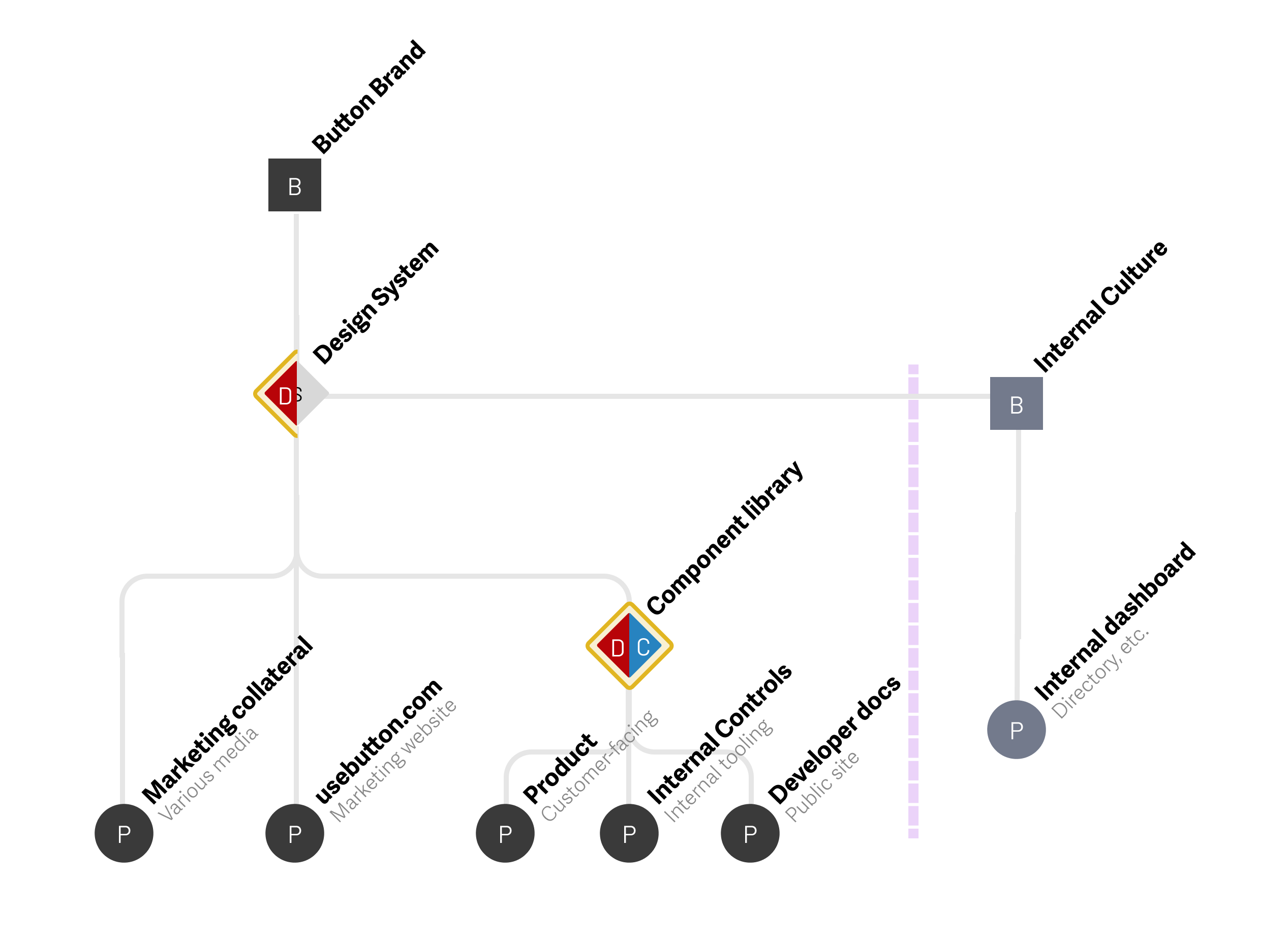
After identifying the problem, we separated our existing design system into brand, marketing, and product needs. The design elements we needed for brand and marketing were a bit different than the components for product.
For brand and marketing, we focused on brand attributes and foundations such as color, typography, and art direction. The output included high-level guidelines and styles that would be interpreted for various needs, such as the marketing website and event collateral and a more detailed brand guide to equip all of our teams. For product, we relied on our brand guidelines to inform our product foundations, followed by components - some of which we redesigned from our existing design system, while others are newly introduced.
The Design Team collaborated with the Marketing and Engineering Teams to align on the following goals:
Our Values
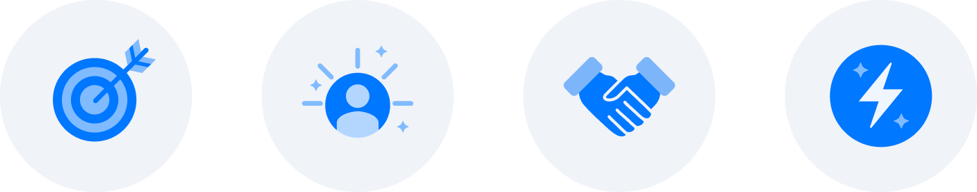
We identify our brand by a few core values:
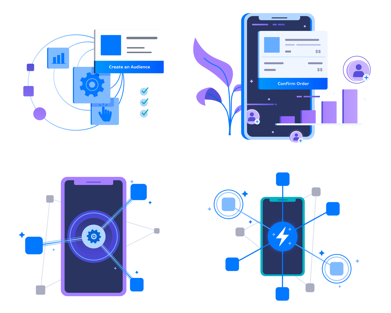
These values directly translate to how we create imagery to represent our brand. After aligning on a modern and stylized look and feel, we used these inputs to develop visual design principles to guide us in updating our existing assets and creating new ones that all felt cohesive.
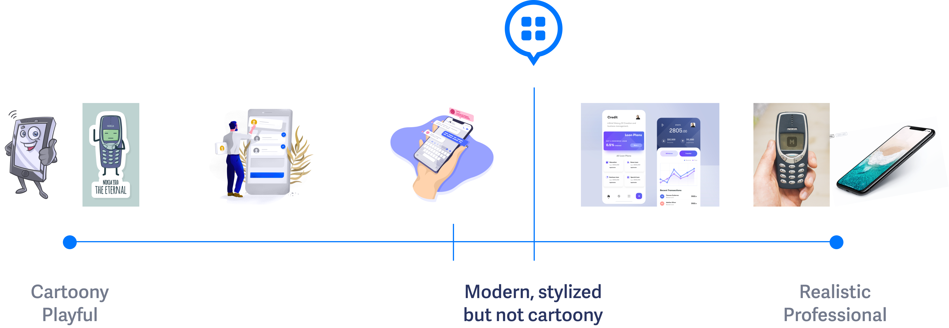
Here are some examples of the visuals that came out of this work:
During our creation process of the Button Design System for product, we made sure to incorporate our brand values into every element and component. We broke product down into two sections:
Foundation
Components
The foundation of a design system includes the essential building blocks to lay before creating individual components. Our foundation includes color, typography, grid, page elevation, and icons. Our design foundations are also aligned with the company brand guidelines so that the Button brand and product feel cohesive.
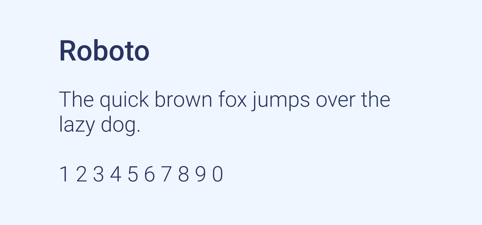
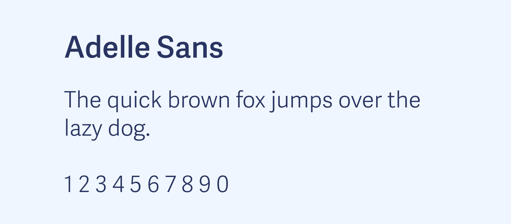
Colors & Fonts
Primary & Secondary Palette:
Button Blue is the primary Button brand color. It's used as one main logo color and for buttons, among other elements.
The secondary palette is to be used sparingly as accents in call-outs and supporting graphics. They should not be used for any large elements or components, like section backgrounds.
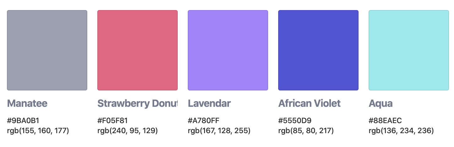
Typography:
We chose these sans-serif fonts for their effectiveness with readability and versatility.
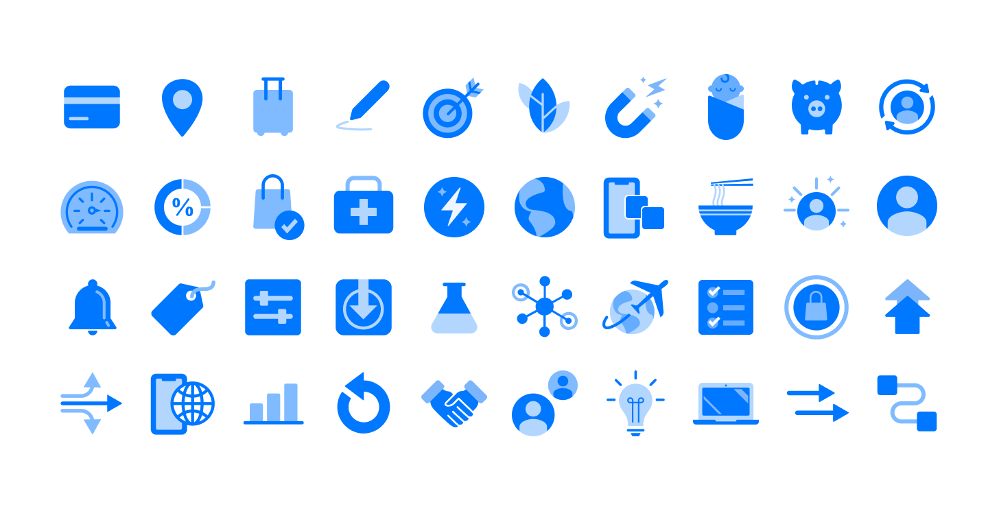
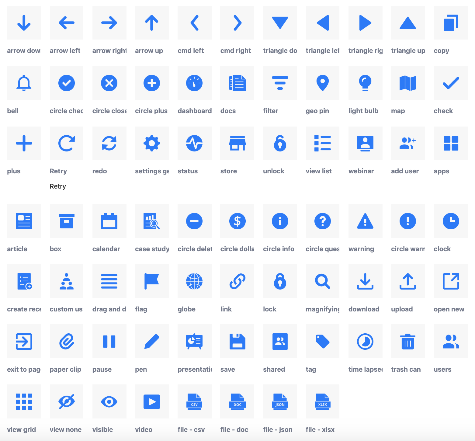
Iconography
When auditing our existing system, before we dove into our new design system, one of the biggest pieces of improvement needed was to our icon set. There were a lot of inconsistencies in overall style, line thickness, and color. We also found a lot of miscellaneous icons that weren't being utilized. We decided to start with a clean slate and only design icons that we would use on day one and we can build off of it on an as-needed basis.
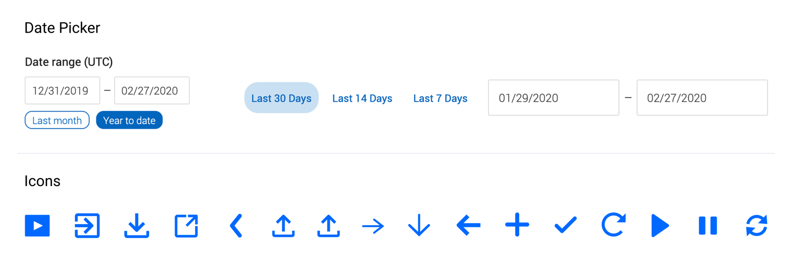
Components
Once our foundation was in a comfortable place we began to think about our components, taking into account the new typography and color palette we had available.
The easiest place for us to start was by redesigning existing components that needed to be refreshed and modernized. This included buttons, inputs, drop-downs, calendars, and date pickers.
Our previous buttons were not robust enough to provide a good experience for our users. They lacked interactive states such as hover and click states. They also did not allow for additional ways of communication such as through icons and tool-tips. When redesigning, we considered how we wanted to communicate with our users so they felt confident in the actions that they were taking.
Old Buttons
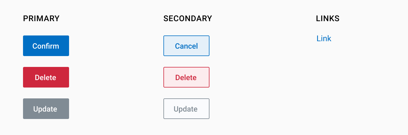
New Buttons

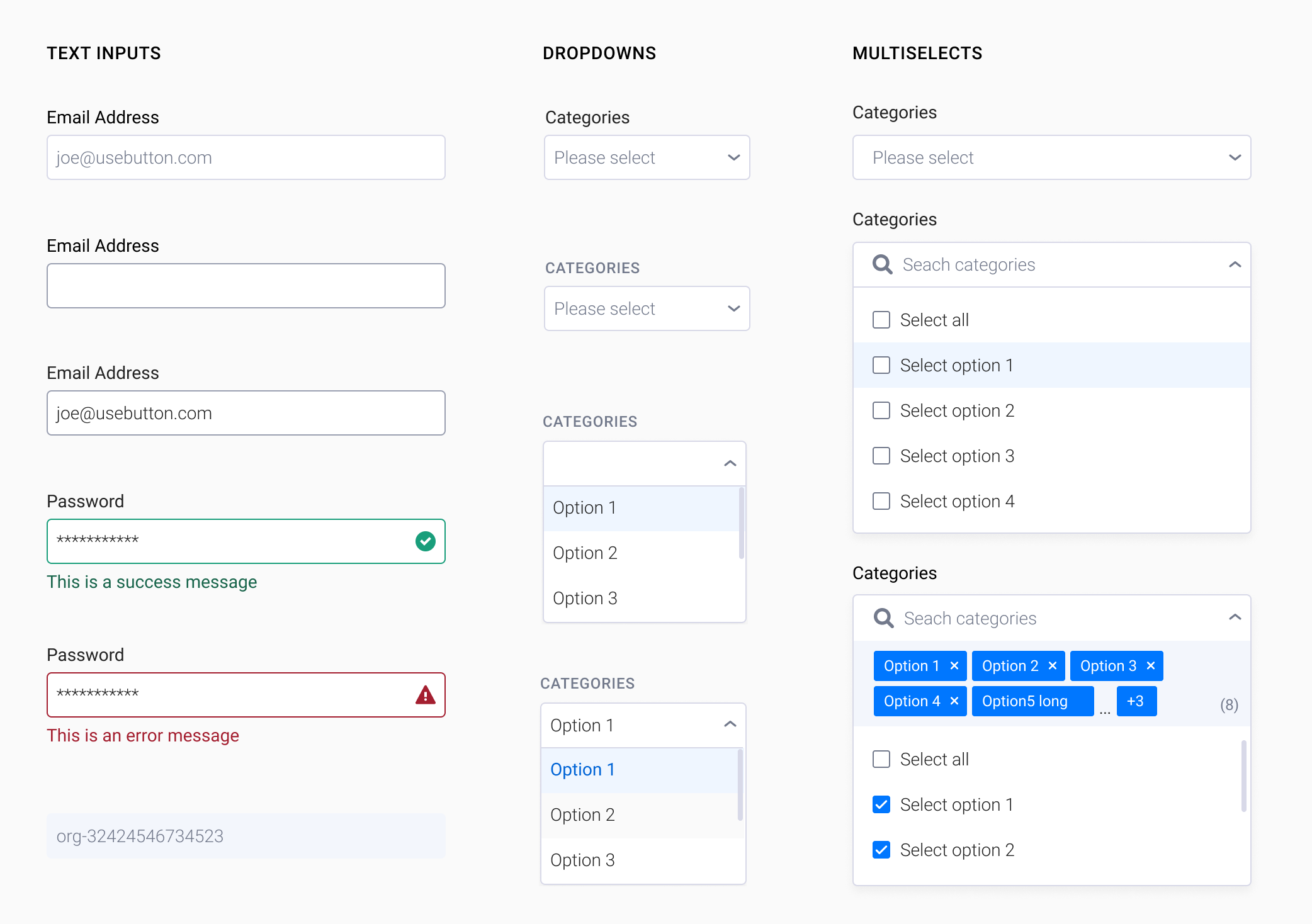
Inputs and Drop-downs
We took a similar approach with the rest of the components we redesigned where we identified what was not working with our existing components in order to improve and increase usability with our new set of components.
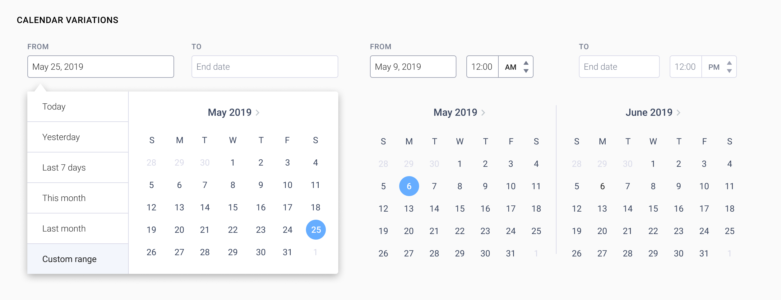
Calendars & Date Pickers
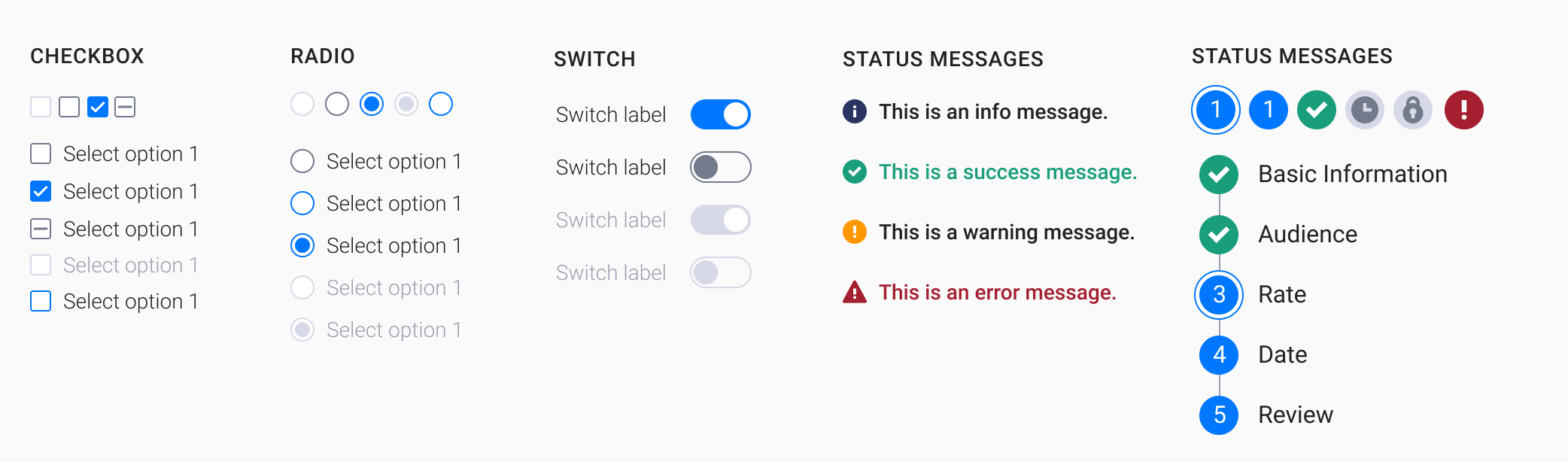
Other Redesigned Components
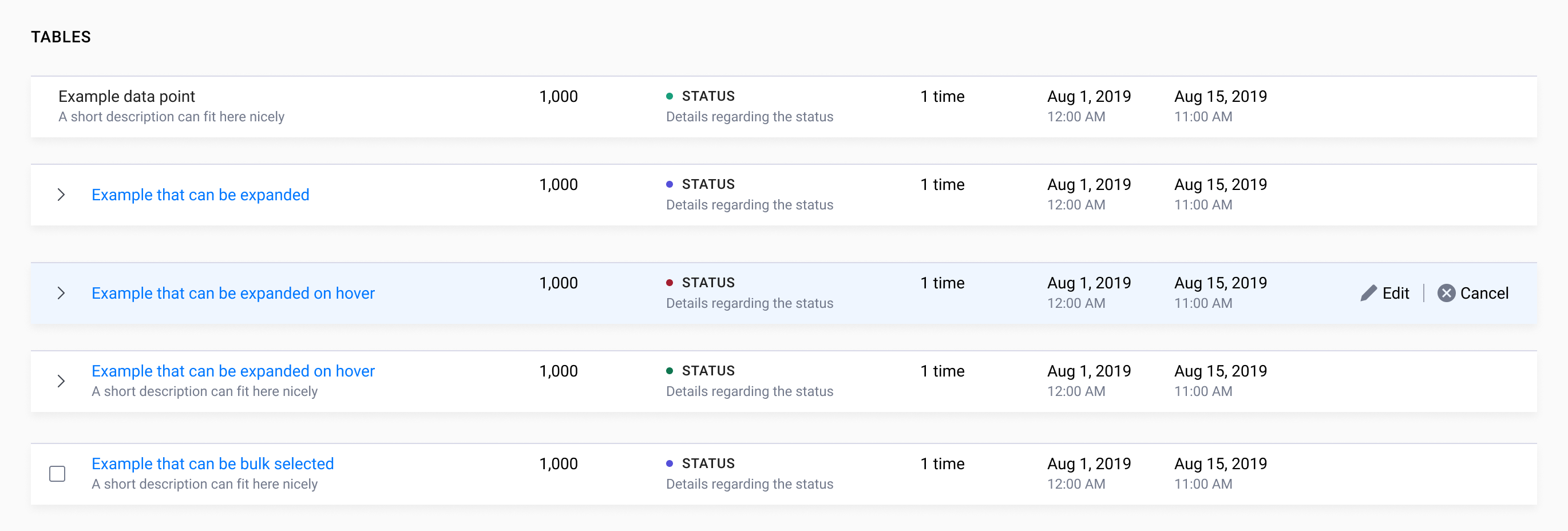
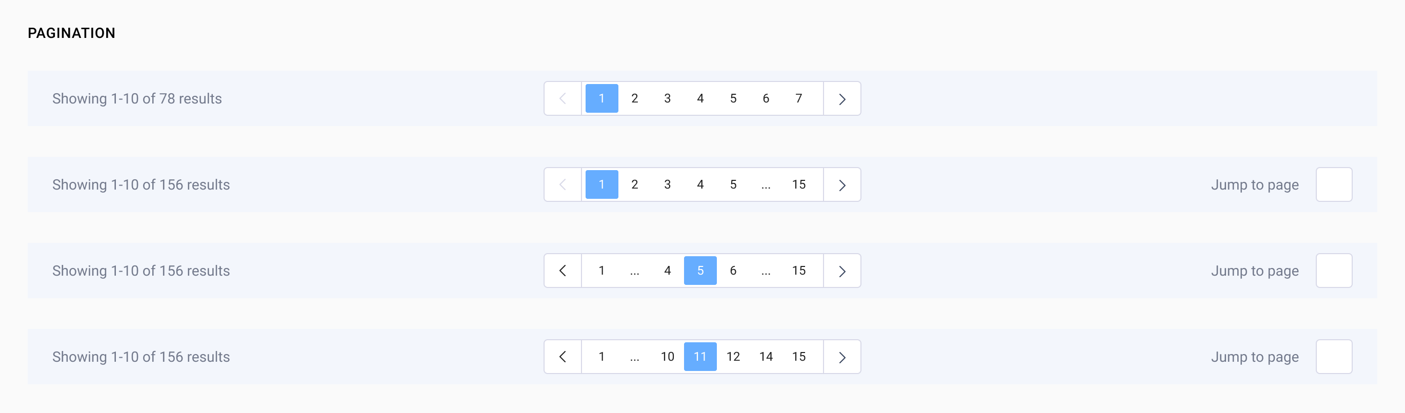
Next we started ideating new ways we could solve existing problems, which provided us the opportunity to create new components such as tables and pagination.
Tables
Pagination
Like any great design system, ours will improve as we continue to build products and optimize our interface usability. We are currently testing the strength of our foundations and components by incorporating our design system across multiple product teams. In doing so, this has allowed us to focus on the usability of our designs and user journeys. We're also able to increase the fidelity based on the needs. To add to that, we are also continuing to design with accessibility in mind.
Another focus of ours is creating a consistent tone and voice through UX copywriting. We are auditing our existing copy and content and flagging inconsistencies which will be rewritten to ensure all communication is clear and informative.
Finally, we want to increase the level of detail and consistency through documentation. This includes ensuring that engineers have the documentation they need to feel supported while they continue to develop the components now and in the future. Our ultimate goal is for our design system to be the source of truth and a robust toolkit for both new designers as well as engineers.

.png)
.png)
