

As a UX Engineer, I've always found it bemusing how wary many engineers are of UI design. "I don't have an eye for it," they'll say, or "I can't draw to save my life!" Maybe this describes you. If so, I'd like to convince you that anyone, you included, can design great UIs (no artistic gifts required).
But first, let's take a step back. What is UI Design? I'm fond of the following definition:
"The design of interfaces for software, with a focus on maximizing usability."
In other words, UI design is about helping your users solve whatever problem brought them to your product. There's no magic involved–just like great code, great designs are grounded in logical best practices. Through the following tips, I hope to make UI design feel like less of a black box and more like an exciting new skill to add to your toolkit.
As a general rule of thumb, when it comes to UI, familiarity is a good thing. Often, the difference between a user sticking with a new product and giving up is no more than a few seconds of confusion.
Here's an example. What do you think clicking the "Subscribe to our Newsletter" button in the footer below does?
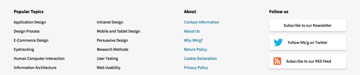
Since it's styled differently from the other links in the footer, my best guess was that a modal would appear. Nope. It was a regular old link, triggering navigation to another page. Experiences like these disorient users, making them that much more likely to abandon your product.
You may also be wondering: If you're not too familiar with interface design, how do you know what will or won't disorient users?
If you're starting from scratch, a great way to get a jump start on consistency is to use an open source design system, such as Google's Material Design. These systems were developed based on UX best practices and offer both reusable components and the guidance on how to use them appropriately.
One of the easiest ways to create a confusing interface is a lack of attention to visual hierarchy, the presentation of elements on the screen in a way that clearly illustrates their relative importance and relationship to one another. It's easy to write off styling as unnecessary polish, but differentiating the elements on your page serves an important role in the user experience. Consider the following modals:
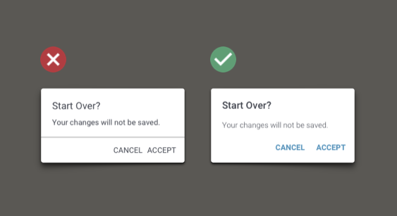
In the right-hand modal, the variance in font weight and color makes it easier to parse the contents at a glance. As much as we'd like to think that users are fully engaged with our UIs, much of the time, they're merely scanning. When applied throughout the interface, subtle changes like these can make it much easier to navigate an interface.
Icons can be eye-catching and fun–just ask that friend of yours who ends every text message with an emoji . Without the appropriate context, however, icons can also be downright confusing. (Imagine that friend's messages, but only the emojis.) With the exception of a handful of highly universal icons, such as the magnifying glass for "search," most icons are not recognizable out of context. Consider the following screenshot of the Photos app on my iPhone (shoutout to our beloved team dog, @rubyrubyroooo):
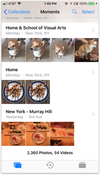
Any idea what that icon in the middle of the bottom row means? Rewind? Time travel, perhaps?
Nope–it means Memories! Yeah, I couldn't have guessed either. That's why the actual Photos app includes labels in the bottom row.
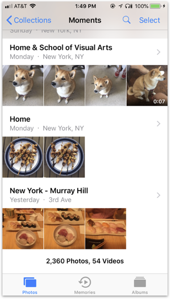
These simple text labels allow users to associate the icon with the function and quickly recognize it next time they return to the app. Next time you add an icon to your interface, take a second to ask yourself: "Would a random person on the street know what this means?" (Even better, ask an actual random person.) If the answer is no, you'll likely want a label.
When you're busily cobbling together a design, it can be tempting to throw some lorem ipsum in the UI and call it a day. Marketing will fill it in later, right?
Wrong. By using placeholder text, you're losing the opportunity to consider, "Why is this text here?" Text is as much a part of the UI as any other component, and it's a tricky one to use effectively. Consider the following design:
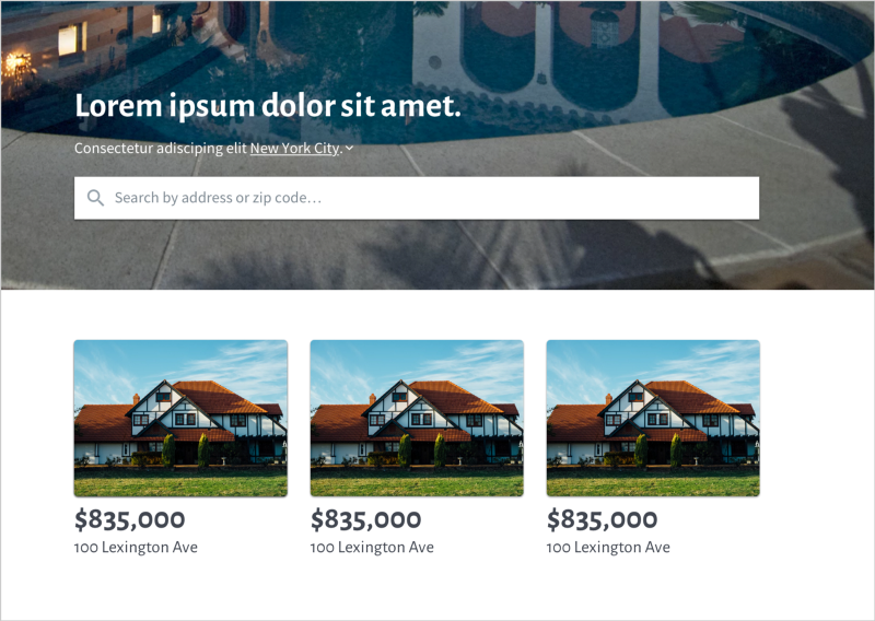
You can guess from the imagery that this website has to do with real estate, but with placeholder copy, the call to action is not explicitly obvious. Swap the placeholders for realistic copy, and the target audience and voice become much clearer.
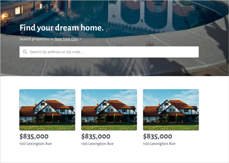
When designing, you owe it to your users to give copy the same attention as the rest of your UI. The writing doesn't have to be worthy of a Pulitzer, but it should serve a clear purpose. If not, you may be better off omitting it.
The practice of web accessibility is creating websites in a manner that accommodates users with diverse abilities. If you've done any frontend engineering, you're likely familiar with developing for accessibility. When wearing your designer hat, you have an equal responsibility to ensure that all sorts of folks, on all sorts of devices and connections, can use your designs seamlessly.
Consider the following form inputs. Pretty straightforward, right?
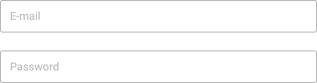
Not necessarily. The use of placeholders to identify these inputs may seem like "clean" or "minimalist" design, but to a visually impaired person–or anyone on a monitor with poor contrast–those low-opacity placeholders may not be visible at all. And even for a person with 20/20 vision, labels that disappear as soon as you start typing are a recipe for frustration.
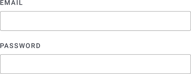
Thankfully, this problem is easily solved simply by moving the labels outside of the inputs:
Poor color contrast isn't limited to form placeholders, either. When you select colors for your site, use a contrast checker to ensure that your background/foreground color combinations have sufficient contrast. The Web Content Accessibility Guidelines outline three levels of conformance: A (lowest), AA (mid range), and AAA (highest). Not sure where to start? AA corresponds to 20/40 vision, or that of an average 80-year-old, and is a good target for most websites.
There's much more to designing for accessibility than I can cover here, but if you'd like to learn more, I recommend reading My Accessibility Journey, an article by Manuel Matuzović that elegantly outlines many of the challenges and opportunities in the field today.
Hopefully, these tips helped illustrate that UI design is a skill that anyone can learn. If you're curious about how to combine design and engineering on the job, check out UX Engineering: Bridging the Gap Between Design and Development, my article on how I crafted my own role as a UX Engineer. And if you'd like to work at a startup that encourages continuous learning, check out our open roles–Button is hiring!
This post was adapted from UI Design for Engineers, a lightning talk I gave at August 2018's BrooklynJS. If you're in the NYC area, check them out!

.png)
.png)
