

Charts may be old hat in the world of data visualization, but anyone who's ever tried to make sense of raw data knows how much of a difference a humble chart can make. At Button, we use charts in our Dashboard to make it easy for users to glean insights about their performance. Making those charts come to life, however, isn't so straightforward. In this post, I'll explain how we leveraged the respective strengths of React and d3 to create declarative, performant chart components.
A Google search for "JavaScript charting library" will turn up hundreds of results, each promising to be the fastest, easiest, and most flexible. Over the past year, our frontend team tried a number of those libraries. It was a frustrating experience, to say the least. For every feature that worked out-of-the-box, we found a bug (inaccurate tooltip trigger areas) or missing feature (multiple axes, interpolation support, and animation, just to name a few). The breaking point came last fall, when our latest library of choice was abandoned. Faced with a dependency on an old version of React, we decided that external charting libraries were more limiting than liberating and returned to the drawing board.
In our search for a better charting solution, we stumbled across d4, an experiment in combining React and d3 to create declarative data-driven documents. Most frontend developers will be familiar with d3, Mike Bostock's library for building data-driven documents. d3 is incredibly powerful, and it can be used to build just about any type of chart. Where d3 pales, however, is readability. Its concept of selections harkens back to an earlier era of web development, when imperative view manipulation was common. Following the rise of React, declarative views have become the new norm, making it much easier to tell what a piece of code will render at-a-glance. d4 is a happy compromise, using d3 functions for computing SVG path descriptions and React for rendering the actual path elements. Hopeful that the pattern would give us the clean, extensible code we were looking for, we used d4 as the basis for Button's first charting library.
One major benefit of building an internal library is that it doesn't have to do everything. We only needed a handful of chart types, but we had a long list of "nice-to-have" features for those charts. With d4, we were able to create chart components tailored exactly to those needs. We followed the same general pattern for each component:
1. Find an example of the chart type in the d3 gallery.
2. Translate any d3 functions that render SVG elements into JSX.
3. Identify values that vary between charts of the given type in our application and turn them into props.
4. Style and polish the component as needed, using React Storybook to test different combinations of props.
Here's a simplified example of a DonutChart component, translated from this d3 example:
import React, { PropTypes } from 'react';<br>import { arc, pie } from 'd3-shape'; class DonutChart extends React.Component {<br> static propTypes = {<br> data: PropTypes.arrayOf(PropTypes.number.isRequired),<br> arcWidth: PropTypes.number.isRequired,<br> width: PropTypes.number.isRequired,<br> padAngle: PropTypes.number.isRequired,<br> className: PropTypes.string<br> } render() {<br> const { data, arcWidth, width, padAngle } = this.props; const radius = width / 2;<br> const colors = ['#7B6888', '#31C0DA', '#FFC107']; const arcAngles = pie()<br> .padAngle(padAngle)(data); const arcGenerator = arc()<br> .outerRadius(radius)<br> .innerRadius(radius - arcWidth); const transformStyle = {<br> transform: `translate(${width / 2}px, ${width / 2}px)`<br> }; return (<br><svg<br> width={width}<br> height={width}<br> className={this.props.className}><br><g style={transformStyle}><br> {arcAngles.map((d, i) => (<br><g className="arc" key={i}><br><path<br> d={arcGenerator(d)}<br> style={{ fill: colors[i % colors.length] }} /><br></g><br> ))}<br></g><br></svg><br> );<br> }<br>}
Simple as it may be, the above component can generate a wide variety of donut charts. Here are a few examples with variable props:
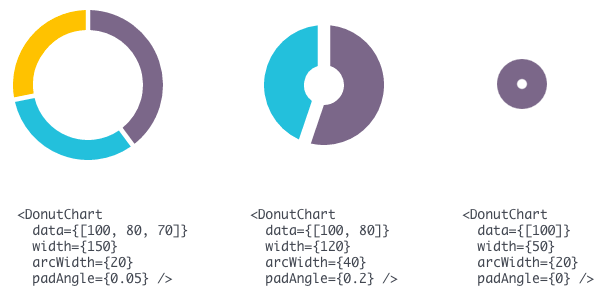
You can try out the above examples in this JSFiddle.
Throughout this process, we found the pros and cons described on the d4 homepage to be accurate. Our impressions were mostly positive: In the majority of cases, the data-wrangling aspects of d3 were separable from the rendering functions, and the modular nature of d3 4.0 ensured that we weren't weighing down our app with excess imports. We haven't tested this hypothesis, but we suspect that writing the rendering code using React's declarative API also nets us the performance advantages of reconciliation.
There were some exceptions in which the calculations and rendering were inextricable, such as the d3 axis-generation functions. In that particular case, we chose to use another common strategy for combining d3 and React, which wraps the d3 rendering calls in a helper function that is called in componentDidMount and componentDidUpdate. While it's not as elegant or performant as d4, this approach still allowed us to let d3 do the heavy lifting and share a single Axis component between different chart types.
On the whole, we're happy with what we've built. Maintaining our own charts has made it easy to make incremental improvements, such as implementing our own custom tooltips. The downside of building only what you need, of course, is that you sacrifice generalizability. The limited number of chart types and inputs we support means the library wouldn't be especially useful to open-source in its current form. That said, if your goal is to build highly customizable, future-proof charts for your React codebase, we'd heartily recommend the d4 approach.

.png)
.png)
