
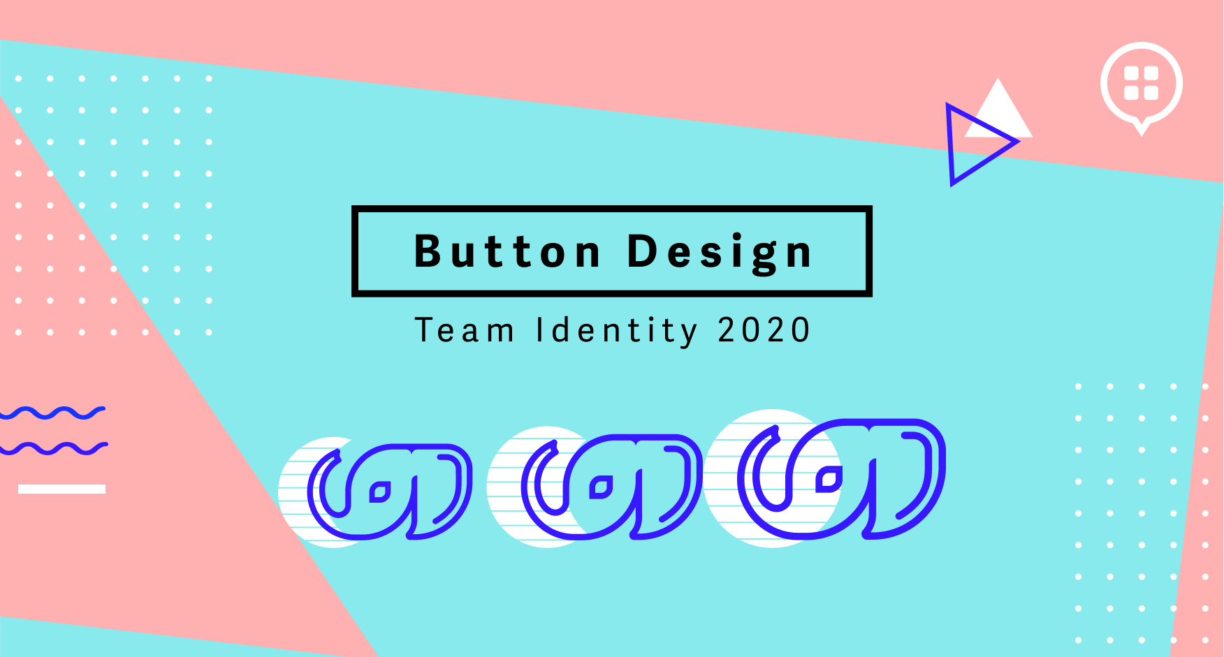
Brand identity is how a business is portrayed to its customers, and the same can be said about a team identity. The Button design team spent a portion of last quarter defining and creating a design team identity. Our goal was to develop an internal brand to create unity and alignment within our team.

Why the elephant?
We wanted to create a logo that would be easily recognizable, memorable and reflect our core principles. As this is an internal design team logo, we were not confined by any preexisting branding such as the Button logo. We did however, want to ensure we upheld our brand voice when visually communicating. So, why the elephant?
Well, elephants are:
These values are what we strive to live by as a design team.
Step one: Creative search and ideation
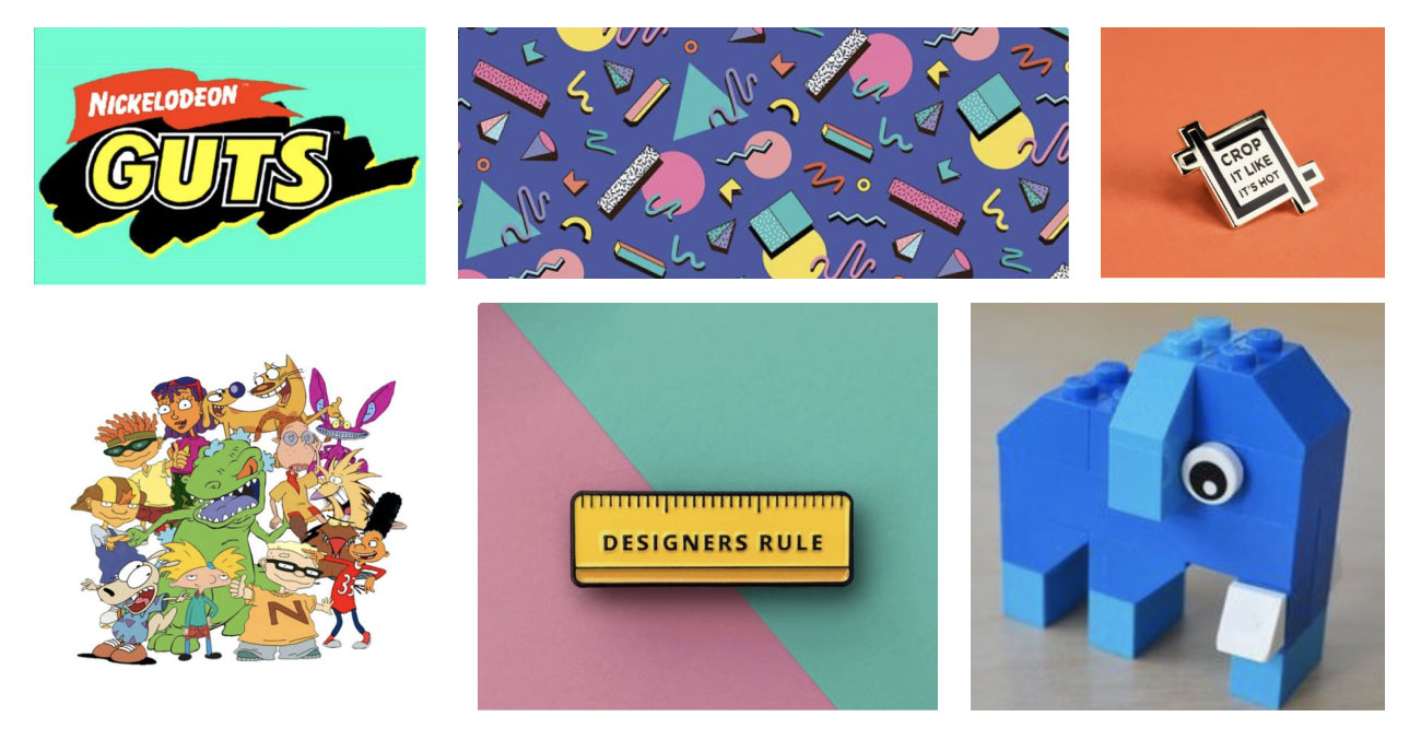
Our process began with a creative search. This involved a session of brainstorming and researching with the entire team. During this session we spit-balled ideas regarding aesthetics and style. Nostalgia for the 90s had major appeal to us all (what up, Millennials!). We were drawn to the bright, playful patterns of the Memphis Design style and the fun, explosive colors from our favorite childhood Nickelodeon cartoons (Hey Arnold, anyone?). We then conducted competitive analysis which gave us an understanding of what other brands have created. As a team, we identified logo attributes that we found to be strong as well as weak. We also remained consistent with successful logo design patterns. The best logos are easily recognizable by their shape, color, and typography.
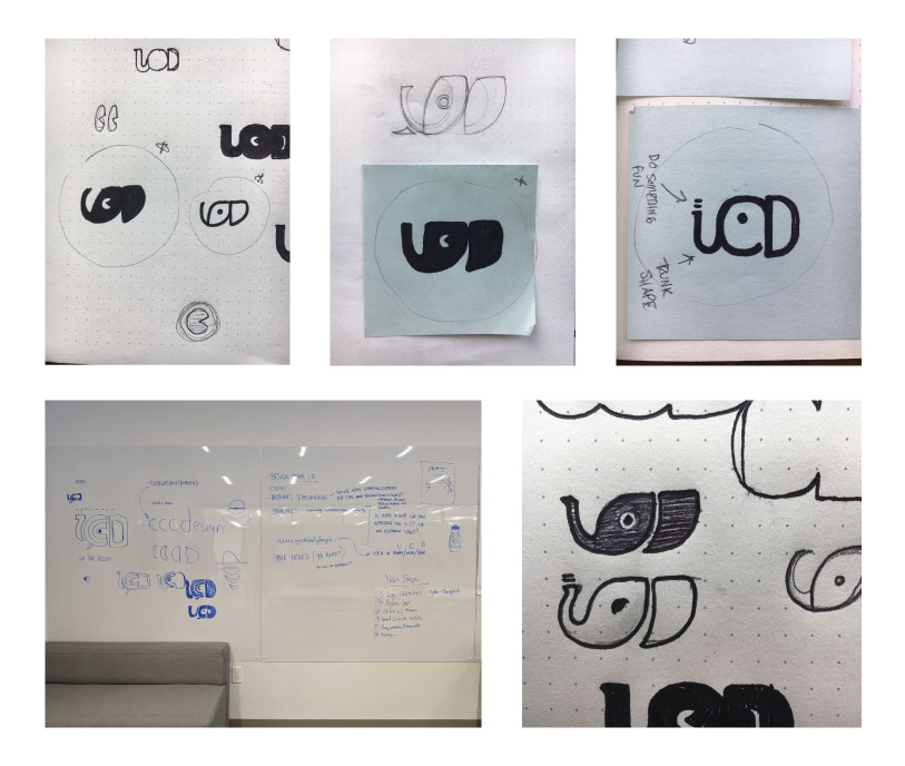
Next, we began the ideation process. At this stage, we created several lo-fi sketches based on the outcome of the creative search session with the team. To get things rolling we also created a list of values and terms associated with the design team. We found ourselves focusing on the term "User-Centered Design". We started working with the shapes of the first letter of each word (U, C and D) and quickly found ourselves with an elephant. Excitement took over as we started seeing the connection of the elephant and other values we had written, values such as curiosity, collaboration, creativity.
Step two: Prototyping
Following the incredibly productive ideation sessions we reviewed lo-fi sketches as a team. We discussed the smoothness of the curves, the distance of the lines to the eye, what shapes worked best, and why. Once we gathered that feedback, we were able to dig into the design itself. This part of the process emphasizes intent in design, really thinking about how and why you're using the design elements. Below, you'll see the evolution of the lo-fi sketches to a more hi-fi design.

Step three: Final team review
After prototyping, we had a final team review. This is where constructive criticism and feedback of the final logo happens. Here we discussed things like whether or not the curve of the trunk needed to be tweaked slightly? Do we envision it as black and white only or can we use any color? Should it face to the left always? Once we worked through those thoughts and set rules, we were able to present a final product.
Now that we have a logo for the team, we will be considering what our color palette might be, creating team branded supporting elements for our internal communications, and planning out everyone's favorite - swag! It will probably be some time before swag happens, but here are some ideas that have us stoked for what's to come!

For more articles from the Button design team, check out design section of our blog.

.png)
.png)
